Transportation
The information below includes preliminary data findings that will be updated throughout the Where We Live NYC process and do not represent the City of New York’s final findings or position on the information.
New York City is by far the most populous city in the United States, and a majority of residents rely on public transportation in their daily travels. According to the Metropolitan Transportation Authority (MTA), the New York City subway system served 5.6 million passengers on an average weekday in 2017, while City buses served 2.3 million passengers1. To put these numbers in perspective, there were almost as many public transit riders in New York City on an average weekday in 2017 than in all of the other largest municipalities in the United States combined.2
How people commute to work and the extent of their commute times are crucial aspects in many New Yorkers’ lives. In addition, public transportation provides necessary access for many New Yorkers who do not work. The first part of this brief explores geographic patterns of transit access in New York City, with a particular focus on New Yorkers’ commutes. These indicators may provide insight into how residential living patterns generally—and housing segregation specifically3— create or perpetuate disparities in accessing transit by race, ethnicity, and disability status, which are the subject of the brief’s second part.
Geographic Patterns of Transit Access4
Manhattan, Brooklyn, and the Bronx are more accessible by subway and Select Bus Service (SBS) than Staten Island or Queens. The Rapid Transit Service Area map below shows ½ mile walksheds to rapid transit stations5. Manhattan, parts of the Bronx, and Brooklyn are well served by subway and Select Bus Service (shown in darker blue and green, respectively), but there are large gaps in the central Bronx and its outer edges, southeast Brooklyn, throughout Queens, and Staten Island. Express buses (light blue), the Long Island Rail Road (pink), and Metro-North (orange) provide some additional rapid transit coverage. These forms of transit, however, cost more than the standard subway fare, and pricing can vary depending on the distance of travel and the time of day (peak vs. non-peak).
Upper Manhattan, northwest Brooklyn, and eastern Queens have the highest shares of commuters who choose the subway as their primary mode of transportation to work. The Transportation to Work – Subways map below shows the share of residents commuting to work by subway. The darker shades indicate higher shares of residents whose commutes consist mostly of subway rides. Usage of the subway is related to the location of subway stations throughout New York City.
While New York City has an extensive subway system, the majority of subway stations are not accessible to people with disabilities. The Subway Accessibility map below distinguishes accessible from inaccessible subway stations throughout New York City. In addition, not all stations categorized as “accessible” in the map below are fully accessible—some stations are only partially accessible6.
New Yorkers living in central Brooklyn, southeast Queens, parts of the Bronx, and Staten Island are likely to rely on buses when commuting to work. The Transportation to Work – Bus map below shows the share of New Yorkers who travel on buses for the longest distance of their commute to work. Darker shades, which denote higher shares of bus commuters, are located in areas that are not accessible by subway.
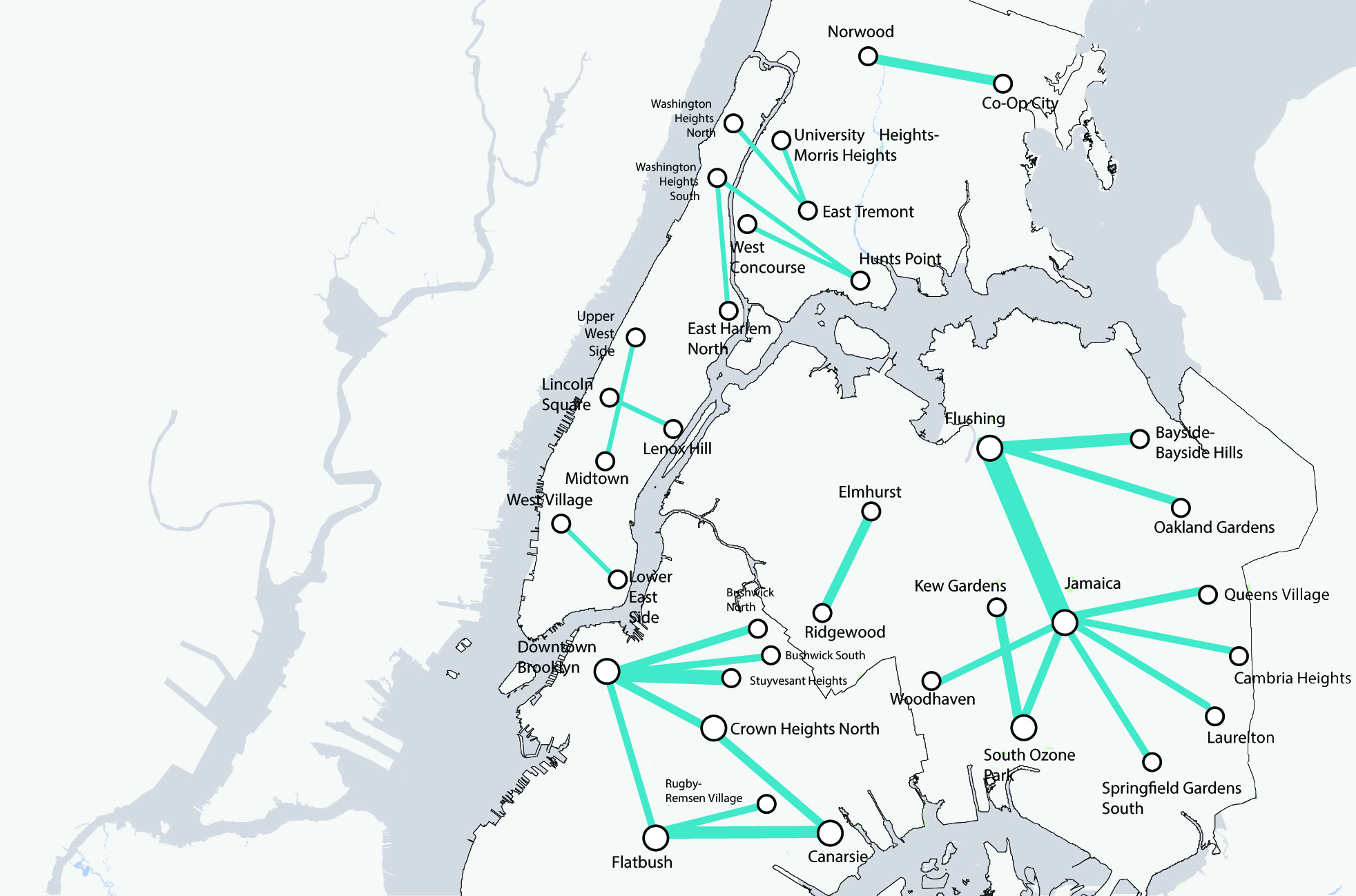
Some New Yorkers have to rely on particularly slow bus trips. Many New Yorkers rely on buses in their daily travels. However, travel can be a challenge in some areas because of traffic, street conditions, and other factors. The Long and Low Bus Trips map below shows 28 heavily traveled routes that are particularly long (taking over 30 minutes to traverse) and slow (slower than 8 miles per hour). In many cases there may not be a better transit alternative to these time-consuming trips, which are particularly concentrated in outer boroughs.
Long and Slow Bus Trips7
New Yorkers living on Staten Island, in eastern Queens, and the east Bronx are most likely to use a personal car to commute to work. The Transportation to Work – Car map below shows the share of commuters primarily using a personal car by census tract. This map mirrors the Transportation to Work – Bus map above regarding bus commuters, highlighting Staten Island, western Queens, and the east Bronx. Lack of access to rapid transit may require residents in these areas to rely on cars, although New Yorkers who want to own a car might also choose to live in areas where they do not have to pay a premium for living near subways.
Midtown Manhattan has the highest concentration of New Yorkers who walk to work. Shares of New Yorkers who walk to work by census tract are shown on the Transportation to Work – Walk map below. New Yorkers who walk to work are mostly concentrated in Midtown Manhattan. Some smaller areas where workers primarily walk to work include Borough Park and Williamsburg.
Differences in Commutes by Protected Class
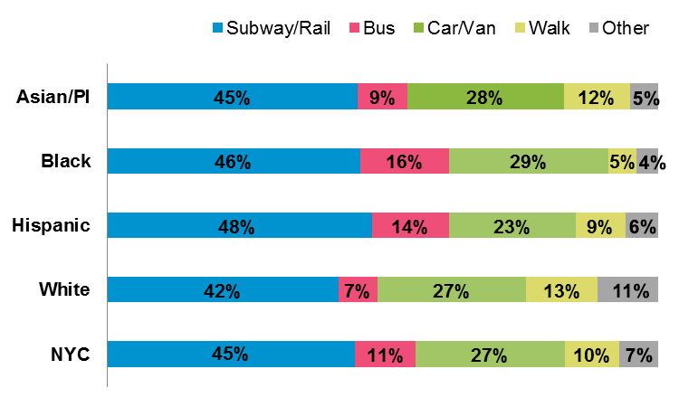
Means of commuting to work vary by race, ethnicity8, and disability9 status. The Means of Transit to Work by Race and Ethnicity chart below shows the mode of transit on which New Yorkers travel to work for the longest distance by race and ethnicity. White New Yorkers use the subway and buses less than other racial and ethnic groups (49% as compared to between 54% and 64%). Hispanic (14%) and Black New Yorkers (16%) are twice as likely to use buses in their commutes as White New Yorkers (7%). Asian/PI (12%) and White (13%) New Yorkers are more likely to walk to work than Black (5%) or Hispanic (9%) New Yorkers.
Means of Transit to Work by Race and Ethnicity10
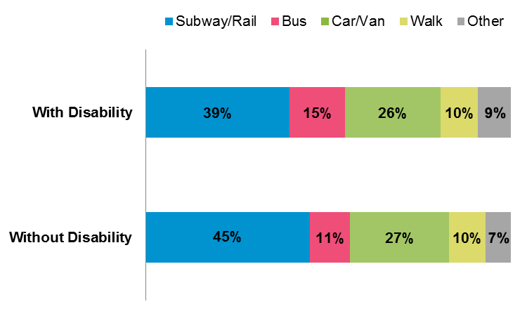
The Means of Transit to Work by Disability Status chart below shows the mode of transit to work by disability status. New Yorkers with a disability are less likely to use the subway (39% as compared to 45%) and more likely to use the bus (15% as compared to 11%) than New Yorkers without a disability. This difference may be related to differences in accessibility between subways and buses.
Means of Transit to Work by Disability Status11
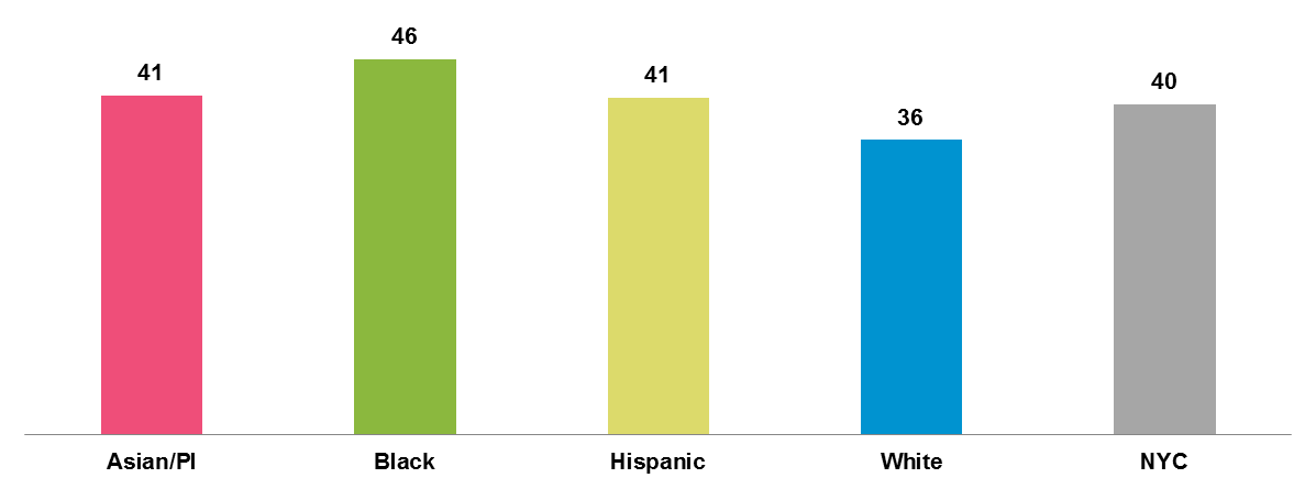
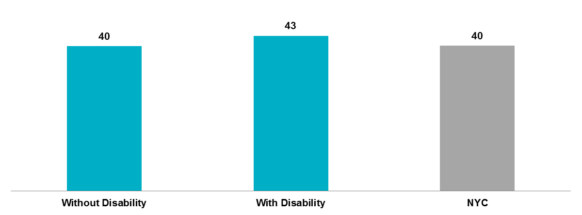
There are differences in travel time to work across racial and ethnic groups, as well as disability status. The Travel Time to Work in Minutes by Race and Ethnicity chart below shows the average travel time to work for each racial group (regardless of mode of transit), while the Travel Time to Work by Disability Status chart below shows the average travel time by disability status. It takes an additional five minutes for the average Hispanic and Asian/PI New Yorker and an additional ten minutes for the average Black New Yorker to get to work as compared to the city average. Also, it takes New Yorkers with a disability an additional three minutes to get to work as compared to New Yorkers without a disability.
Travel Time to Work in Minutes by Race and Ethnicity12
Travel Time to Work by Disability Status13
- Metropolitan Transportation Authority, “Subway Ridership at a Glance,” retrieved October 24, 2018, from: http://web.mta.info/nyct/facts/ridership/.
- U.S. Department of Transportation, “Transit Profiles: 2017 Top 50 Summary,” retrieved November 28, 2018, from: https://www.transit.dot.gov/sites/fta.dot.gov/files/docs/ntd/transit-agency-profiles/130056/2017-transit-profiles-top-50-summary.pdf.
- HPD has also prepared a separate brief that includes information on neighborhood racial concentration. Please see the Where New Yorkers Live tab
- Unless otherwise noted, this page uses data primarily from the 2012-2016 American Community Survey, the latest five-year estimates available at the time of writing. All estimates are subject to both sampling and nonsampling error. Estimates based on five-year estimates, such as 2012-2016 ACS data, may obscure considerable changes in neighborhood conditions occurring throughout that period of time.
- “Walkshed” is defined as an area within a ½-mile radius of the station.
- In “fully accessible stations,” all platforms are accessible. “Partially accessible stations” have only some accessible platforms, which might limit travelers’ ability to transfer between subway lines.
- Source: NYC Department of Transportation, “2017 Bus Forward Report”, Page 12.The MTA identified trips between neighborhoods that take longer than 30 minutes and are slower than 8mph that over 900 people made by bus on an average weekday.
- Unless otherwise specified, we define Asian/PI, black, and White groups as being non-Hispanic. Because the U.S. Census Bureau uses the term “Hispanic” in its population figures, the City will also use the term with regard to its population analyses. The City will use the term “Latinx” when relevant. Non-Hispanic residents are classified by race. Each of these categories also encompasses significant diversity and a range of national origins, which vary across the city’s neighborhoods. This diversity will be explored in the final report.
- Commute times for New Yorkers living with a disability is generated from the American Community Survey (ACS), which asks respondents to report whether a member of their household is living with a disability. Specifically, ACS asks respondents whether a household member experiences any (1) hearing difficulty; (2) vision difficulty; (3) cognitive difficulty; (4) ambulatory difficulty; (5) self-care difficulty; or (6) independent living difficulty.
- Sources: American Community Survey (ACS) 2012-2016, 5-Year Public Use Microdata Sample (PUMS). “Other” includes biking, working from home, ferry, motorcycle, and other. Mean travel time to work does not include people not working, person under 16 years, not in the labor force, unemployed, or employed with a job but not at work, or in the Armed forces with a job but not at work.
- Sources: American Community Survey (ACS) 2012-2016, 5-Year Public Use Microdata Sample (PUMS). “Other” includes biking, working from home, ferry, motorcycle, and other. Mean travel time to work does not include people not working, person under 16 years, not in the labor force, unemployed, or employed with a job but not at work, or in the Armed forces with a job but not at work.
- Sources: American Community Survey (ACS) 2012-2016, 5-Year Public Use Microdata Sample (PUMS). Excluded if worker worked at home, persons under 16 years, not in the labor force, unemployed, employed with a job but not at work, Armed Forces with a job but not at work.
- Sources: American Community Survey (ACS) 2012-2016, 5-Year Public Use Microdata Sample (PUMS). Excluded if worker worked at home, persons under 16 years, not in the labor force, unemployed, employed with a job but not at work, Armed Forces with a job but not at work.
